Using Infographics to Help Students Understand and Communicate Physiology
Professor Derek Scott, School of Medicine, Medical Science & Nutrition
Provide a description and context of your innovative approach to enhance teaching and learning.
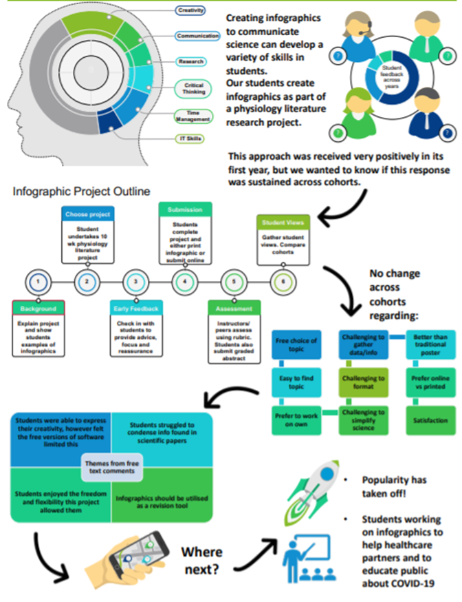
Poster presentations to communicate scientific knowledge/understanding are a commonly used assessment tool. It can be a challenge for students (and staff!) to deliver clear information with minimal text on the poster. We have found that this format did not encourage imaginative project topics or posters. To enhance communication skills, imagination, and student engagement, we adapted an existing Level 3 physiology research projects and increased the emphasis on communication skills through the use of infographics (information graphics). Students were provided with guidance on how to use free online resources to develop their infographics. Students were provided a free choice of topic but had to comply with general guidance on how to develop an infographic. Our approach was supported by VanderMolen and Spivey (2017) who reported enhanced research skills, communication, and approach to learning when their students undertook an infographic based assignment.
Give a rationale for your teaching approach or new initiative.
Health providers use infographics to help patients understand how to improve health, seek help, or prevent disease (Arcia et al. 2016; NHS Digital 2019). Infographics benefit from a strong visual component that makes it easier to understand the messages (Majooni et al. 2018). Davidson and Hargis (2016) have argued that infographics can be effective tools for second language learners. Infographics can be shared easily via web/social media platforms, thus increasing the reach of the author's message (Brunning 2020). Common examples of infographics include the periodic table of elements, transit maps (e.g. London Underground Map), and electoral maps. Infographics have been used to assess understanding, and creative/communication skills of several student populations (Krauss 2012; Davidson 2014; Polman and Gebre 2015; Falk 2016; Gebre and Polman 2016). Traditional scientific poster assignments cater for students who intend to stay in research, but we aimed to cater for students with wider employment interests.
Provide details of how your new teaching approach or solution has been/will be disseminated with colleagues and students within and beyond the University.
This work has already resulted in 8 abstracts related to talks or poster presentations given at national and international conferences. Several of these were co-authored/co-presented with students. An invited full paper was published in 2020 as part of a special edition of the HAPS Educator Journal, where those who had been due to present at the Ottawa conference (cancelled due to COVID) were asked to submit infographics of their projects, based upon our work. This work is the focus of an invited research seminar to be given to the University of Florida, USA on 21 Feb 2022. A further paper is in progress, co-authored with 15 students, focusing on their reflections of undertaking an infographic-based project. This will be submitted to the journal Advances in Physiology Education during this academic year.
Identify the key learning points from your teaching approach or solution, including any lasting impact on teaching in the future.
Students reported that learning the level at which to pitch their infographic was the hardest skill, rather than the actual science. Students also identified that they preferred the ability to complete the infographic online, rather than on paper. They found the content of infographics easier to remember than that of traditional scientific posters. Others reported that this activity made them learn new IT skills they could use in other aspects of their lives. In response to feedback, we have provided students with a basic project plan to help them manage their time more effectively. We also added in a final feedback session where students reflect upon skills they feel they have developed. Staff feedback has focused on how creative and imaginative the students were, and the sheer range of topics that have been researched each year. Themes that appeared consistently in student feedback are summarised in the artefact below.
Explain how you plan to or will evaluate the impact of your initiative.
We already have a significant amount of data derived from SCEF reviews/student-staff liaison feedback. When this assessment was introduced 42/44 students achieved a grade within the 70-100% range, with the average grade being 72.0 ı 4.8 % (error values represent standard deviation). During the previous traditional scientific poster assessment, the average grade was 63.0 ı 1.3 %, with only five students scoring within the 70-100% range (n=47). As a comparator, the average overall course grade was 67.0 ı 6.0%. In terms of student satisfaction, 90% of students (n=44) rated the infographic assessment at either four or five on a five-point scale, where five indicated it totally met their learning needs. Our current paper focuses on reflections of students to understand what what skills they have developed during the project. This assessment model has been adopted by two other PGT courses in SMMSN and by a medical course at Cornell.
Artefact:
Reference List:
Arcia A, Suero-Tejeda N, Bales ME, Merrill JA, Yoon S, Woollen J, Bakken S. 2016. Sometimes more is more: iterative participatory design of infographics for engagement of community members with varying levels of health literacy. Journal of the American Medical Informatics Association 23(1):174-183. https://doi.org/10.1093/jamia/ ocv079
Blackburn RAR. 2019. Using infographic creation as tool for science-communication assessment and a means of connecting students to their departmental research. Journal of Chemical Education 96(7):1510-1514. doi: 10.1021/acs.jchemed.8b00981
Davidson R. 2014. Three investigations in which students present their results in infographics. The Science Teacher. 34-39.
Davidson JT and Hargis J. 2016. Serendipitous faculty development through infographic active learning exploration. International Journal on New Trends in Education, 7(2):50-60.
Falk NL. 2016. Infographic development by accelerated Bachelor of Science in nursing students. Nursing Education Perspectives. 37(5):299-30. doi: 10.1097/01. NEP.0000000000000066
Gebre EH. and Polman JL. 2016. Developing young adults' representational competence through infographic-based science news reporting. International Journal of Science Education. 38(18):2667-2687. doi:10.1080/09500693.2016 .1258129
Krauss J. 2012. Infographics: More than words can say. Learning & Leading with Technology. 39(5):10-14. https:// eric.ed.gov/?id=EJ982831
NHS Digital. 2019. Infographic Facts. NHS Digital Website. [cited 2020 June 26]. Available from: https://digital.nhs.uk/ about-nhs-digital/corporate-information-and-documents/ nhs-digital-style-guidelines/how-we-look/infographicfacts
Polman JL and Gebre EH. 2015. Towards critical appraisal of infographics as scientific inscriptions. J. Res. Sci. Teach. 52 (6):868−893.
Scott D.A. and Jenkinson A.M. 2020. Using Infographics to Help Students Understand and Communicate Anatomy and Physiology. HAPS Educator. Aug: 95-104.
VanderMolen J. and Spivey C. 2017. Creating infographics to enhance student engagement and communication in health economics, The Journal of Economic Education. 48(3):198-205. doi: 10.1080/00220485.2017.1320605